

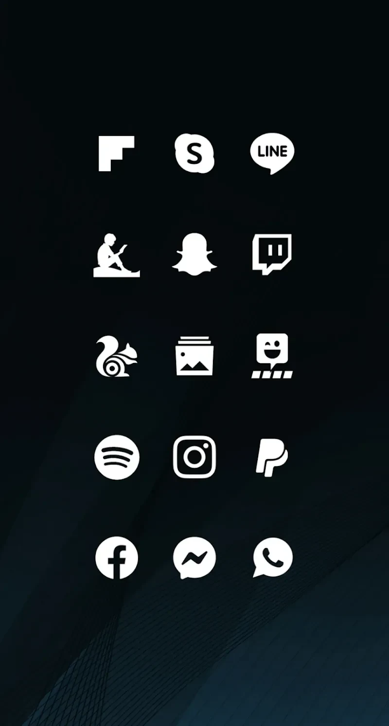
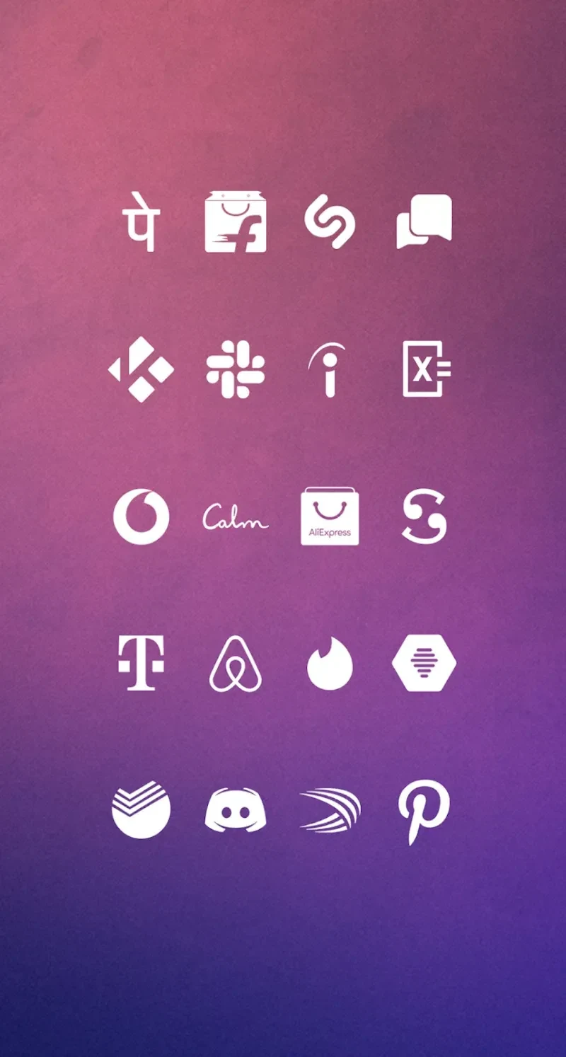
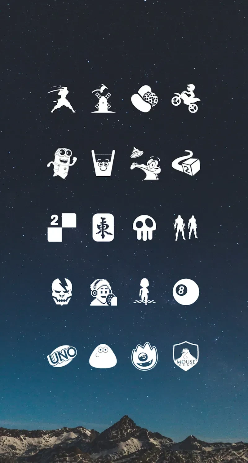
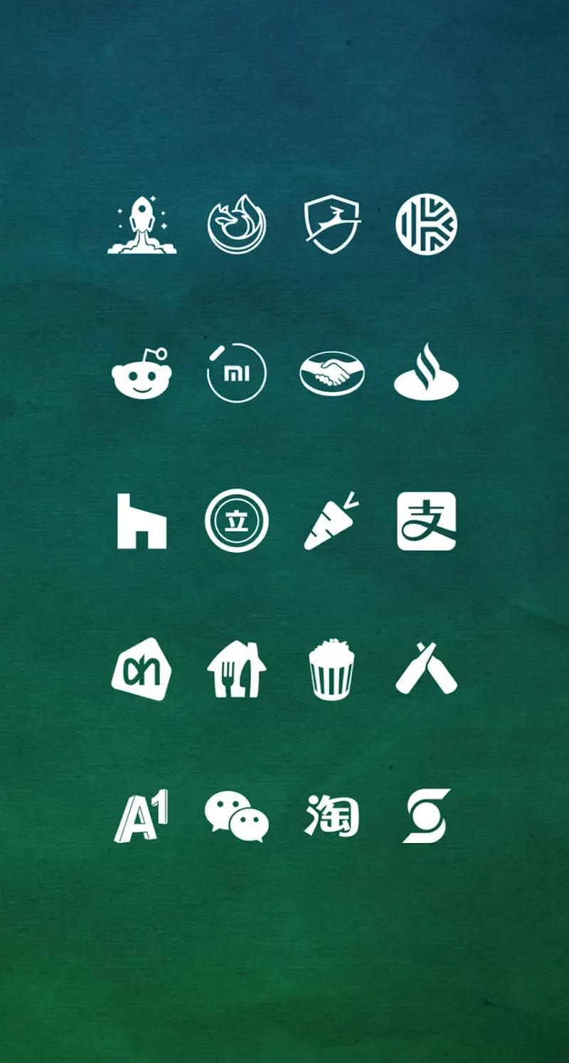
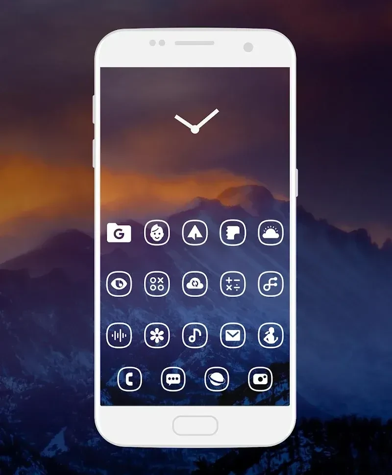
Whicons helps Android users create a consistent monochrome home screen by replacing standard app icons with a large collection of white designs. The app includes more than 7,500 icons, matching wallpapers, and tools for browsing and applying visual changes through a supported launcher. Its simple white treatment keeps the recognizable core of many app logos while removing much of their original color and detail. For users who prefer a restrained interface, this combination can make the home screen look more unified without requiring separate apps for icons and backgrounds.
A large white icon library
The central feature is a library of over 7,500 white icons covering a broad range of applications. The designs are intended to preserve the basic identity of familiar logos while presenting them in a consistent minimalist style. Icons are described as vector-based and high resolution, so the supplied artwork is designed to remain sharp across different screen sizes, including HD phones and larger tablet displays.
Icons can be browsed through categories, which gives users a way to explore the collection rather than searching through an undifferentiated list. However, source feedback indicates that the sheer number of available icons can also make finding a particular design difficult. This means the category structure is useful, but it may not remove every challenge when looking for one specific application.
Wallpapers for a coordinated home screen
Whicons includes cloud-based wallpapers selected to complement its white icon style. Background choices described in the source include solid colours and multicolour images, with landscape, planet, and earth themes among the available visual directions. These options let users decide whether the icons should sit over a simple field of colour or a more illustrative background.
The wallpaper can be set for the main and secondary screens, either with the same image or with different choices. Users can also change the icons and backgrounds regularly or leave a preferred arrangement in place for a period of time. Together, the icon library and wallpaper collection are aimed at producing a more coherent overall interface rather than treating each home-screen element separately.
Applying icons through a launcher
Whicons is used with a compatible third-party launcher rather than applied independently of the Android home-screen system. The source identifies launchers and related options including Nova, Smart, Evie, Niagara, Hyperion, Lens, Lightning, Apex, and Action Launcher. Compatibility can vary by launcher, so the practical setup begins by opening Whicons, selecting the relevant launcher, and tapping Apply.
This launcher-based approach gives users a direct way to review whether their current setup is supported before changing the home screen. The app is listed for Android 5.0 and later, while successful icon application still depends on using a compatible launcher.
New designs and icon requests
The app includes a section for newer icon work, with weekly updates described as a way to view recently created designs. The source says this area can include both sketches and completed concepts, giving users visibility into additions beyond the established library. This helps the collection continue to develop rather than remaining limited to its initial set of icons.
When an application is not represented, users can submit a request from within Whicons. Suggestions and reviews are recorded and may be considered for later updates. This makes the request tool useful for identifying gaps in the library, although an icon request does not guarantee that a particular design will be added.
Who the app may suit
Whicons is most relevant to Android users who want a pure white, minimalist appearance and who already use, or are willing to install, a supported launcher. Its combination of a substantial icon collection, coordinated wallpapers, launcher application, and request feature provides the main tools needed for a cohesive home-screen theme. Users seeking a different icon colour or a launcher-independent setup may find that the app does not match those preferences, since the described design direction is specifically white and its application process relies on launcher support.