

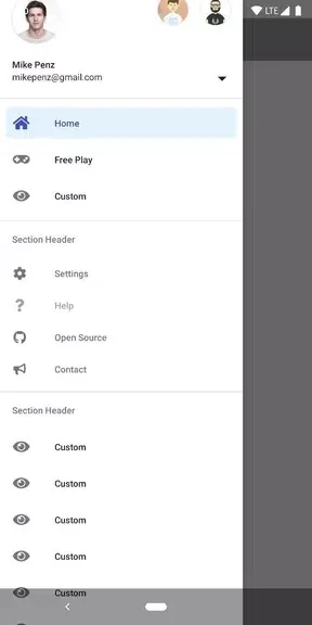
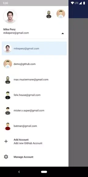
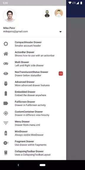
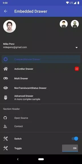
MaterialDrawer Sample helps Android developers add a navigation drawer with a straightforward API and an implementation process intended to take less than five minutes. Its purpose is useful when an application needs structured navigation without building every drawer component from scratch. The sample focuses on Material Design guidelines while leaving room to adjust the drawer’s appearance and behavior. It also demonstrates options for applications that use multiple profiles, making it relevant to projects where users may need to move between accounts or identities from the navigation panel.
Quick integration for application navigation
The library is presented as an easy way to set up a navigation drawer, so developers can begin with an established structure rather than implementing the entire component themselves. Its simple API is intended to make the integration process more direct, while the sample app provides a practical context for seeing how the drawer can be used in an Android project.
Drawer items, colors, and themes
Customization is a central part of MaterialDrawer Sample. Developers can tailor DrawerItems, choose custom colors, and use the available themes to align the drawer with an application’s visual style. The source also describes support for different icon sets. These options can be combined so that navigation remains recognizable while matching the surrounding interface.
Profiles with AccountSwitcher
Projects that support more than one profile can use the AccountSwitcher feature to let people change profiles from the drawer. This connects account selection with the application’s main navigation instead of treating profile switching as a separate flow. Developers can also test the supplied themes or create a custom theme when the predefined styles do not fit the application.
Material Design approach
The drawer is designed to follow Google Material Design guidelines, giving developers a starting point that reflects the conventions associated with Android navigation drawers. The source describes the component as compatible down to an API level, but it does not specify the exact minimum level, so no precise compatibility range can be given here. Further usage information is available through the project’s GitHub page.